


For over 90 years, the London Underground map has been the gold standard for information design. Yet, for the millions of commuters and tourists who traverse the Royal Borough of Kensington and Chelsea, the map contains a baffling contradiction.
At Gloucester Road station, the Piccadilly line (dark blue) and the District and Circle lines (green and yellow) appear to cross without meeting.
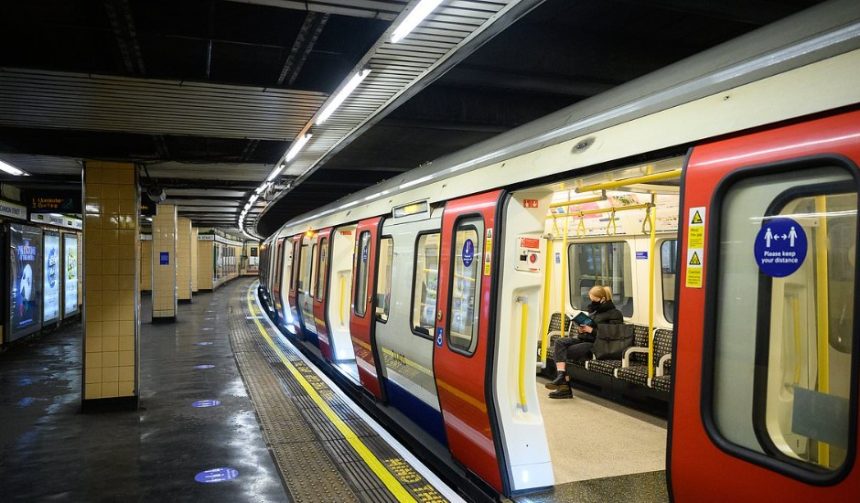
While the map lacks the iconic white-and-black “interchange” circle, the reality on the ground is different: passengers can, and frequently do, change between these lines.
This “ghost interchange” is not an oversight but a calculated piece of social engineering by Transport for London (TfL).
This detailed analysis explores the history, the logistics, and the strategic reasons why one of London’s most vital connections is officially “hidden” from the public eye.
Is Gloucester Road a “Legal” Interchange?
In the strict terminology of Transport for London, Gloucester Road is an operational station for three lines, but it is not marketed as an interchange station.
On the official standard Tube map, the Piccadilly line is shown as a separate entity from the District and Circle lines at this location.
The Comparison with Barons Court and Turnham Green
Historically, other stations suffered similar “erasure.” For years, Barons Court and Turnham Green lacked interchange symbols despite providing easy transfers. However, recent map updates have reinstated these symbols. Gloucester Road remains the notable exception.
The primary reason cited by transport analysts is Interchange Efficiency. At Barons Court, a passenger simply walks across the platform to switch lines. At Gloucester Road, the journey is a “vertical labyrinth.”
Where the Bottleneck Occurs?
The physical layout of Gloucester Road is the culprit behind its map-based demotion. Unlike modern hubs, the station was built in stages by competing railway companies, leading to a fragmented subterranean architecture.
- Sub-Surface (District/Circle): These platforms are located in a wide, shallow cutting, accessible via a short flight of stairs from the ticket hall.
- Deep-Level (Piccadilly): These platforms sit over 20 metres below ground.
- The Connection: To change from the District line to the Piccadilly line, a passenger must:
- Exit the District platform and find the correct corridor.
- Traverse a long, narrow tunnel that often becomes a bottleneck.
- Ascend or descend a substantial staircase (often bypassed by the lazy but required for flow).
- Wait for one of only two large lifts that serve the deep-level platforms.
This “trek” can take upwards of five minutes during peak hours, significantly longer than the seamless transfers found at nearby South Kensington.
Why TfL “Nudges” Passengers Away?
Why would a transport authority deliberately hide a connection? The answer lies in Passenger Flow Management and Capacity Relief.
According to TfL’s Interchange Best Practice Guidelines, the goal of wayfinding is to create a “seamless trail.” However, when a station’s infrastructure cannot handle high volumes of transferring passengers, the map is used as a tool to divert them.
The “South Kensington” Alternative
TfL officially encourages passengers to use South Kensington for Piccadilly/District transfers. At South Kensington, the platforms are better aligned, and the station is designed to handle the massive footfall generated by the Natural History Museum and Science Museum.
By omitting the interchange symbol at Gloucester Road, TfL “nudges” the 90% of passengers who rely on the map to stay on the train for one more stop, thereby preventing a dangerous “crush” situation at Gloucester Road’s limited lift shafts.
Impact on the Public
The “hidden” status of Gloucester Road has created a divide between two types of London travellers:
1. The Disadvantaged Tourist
Visitors often find themselves doubling back. A tourist heading from Heathrow (Piccadilly) to Paddington (District) might look at the map and assume they must go all the way to South Kensington to switch, only to realise later they passed the connection at Gloucester Road.
2. The “In-the-Know” Local
For seasoned Londoners, the omission is a blessing. Because the map discourages the “masses” from changing there, Gloucester Road often remains quieter than the frantic halls of Earl’s Court. 4It has become a “pro-tip” for those who don’t mind a walk in exchange for a less crowded platform.
3. The Impact on Out-of-Station Interchanges (OSIs)
Interestingly, TfL is happy to map Hammersmith as a major interchange, even though it requires exiting the station, crossing a four-lane road, and re-entering a different building.
The fact that an indoor (albeit long) walk at Gloucester Road is excluded while a street-level trek at Hammersmith is included remains a point of contention among UK transport bloggers.
The Evolution of the Map: Will it Ever Be Fixed?
The future of the Tube map is increasingly digital. With the launch of TfL Go and the integration of the Elizabeth line, the physical “paper” map is becoming a heritage object rather than a primary tool.
- Digital Accuracy: Digital journey planners do include the Gloucester Road interchange. As more passengers move to app-based navigation, the “hidden” nature of the station will likely fade.
- Infrastructure Investment: Unless TfL invests in a third lift shaft or a new high-speed escalator at Gloucester Road, which is currently not in the Capital Investment Programme, the station is unlikely to gain its “white circle” on the printed map. The cost of such an upgrade in a Grade II listed station would be astronomical.